[From 14 April 2010]

A stat counter is a common tool that lets bloggers see the number of people who visit their site. I learned about it back in 2005, when I first became acquainted with blogs, and have interacted with stat counters and traffic graphs in my bloggerly life ever since. Every day (ok let’s be real: practically every five minutes), I check my traffic chart on Kloncke to see how many people are reading. I glance at the line graph and its 15-day history, with the current day’s data point climbing ever upward until the stroke of midnight, when its ascending carriage takes a pumpkin-like tumble back down to zero. New day, new stats.
Within the past few months, I noticed myself monitoring my stat charts with increasing closeness and intensity. It became sort of embarrassingly compulsive. I checked my traffic at Gmail-like intervals (read: Too Frequently). And of course, my heart would soar and sink according to the graph’s altitude.
High: high.
Low: low.
Many page views: “My writing is helping people.”
Few views: “This blogging thing is just a narcissistic waste of time.”
Et cetera.
And then, the real kicker: auto-adjusting scale.
Let’s say I’ve been plugging along on my little blog for a month, and one day I get 25 views, the next day 30, the next day 7, and so on. The top of the y-axis represents the largest number of views in a single day: 150. The smallest, one notch above zero, is 3. Then, one day, the blog is viewed 170 times. What happens to the chart?
It changes.
The chart has to adjust itself in order to accommodate new numbers while keeping the frame the same size. Whereas before, 150 looked pretty spiffy all the way at the tippy-top, now it’s only two-thirds of the way up. All the other figures, too, sink lower down on the newly proportioned chart. And, as we’ve said, where goes the line, so goes the mind: yesterday’s high and fine is today’s low and meager.
Same thing happens at the low end of the spectrum. When enough time has passed so that the minimum views is now 20, not 3, the scale shifts again to reflect a higher minimum. The graph appears smoother, more sprawling and more average, without the sharp, spiny, thrilling drama of large differentials.
This is a good joke, I thought to myself one day after a max-171 morphed into an 85. A very good joke, illustrating some key dharma teachings. This is how we go through life. With craving, with aversion. Pinning our hopes on the ups; dreading the downs. The Buddha taught that the root of suffering is craving, clinging: desiring only pleasant experiences and shunning the unpleasant ones. Even the inevitable unpleasantries of birth, old age, sickness, and death. We want only high numbers; no low numbers on our stat graphs.
Then, there’s the limitless nature of craving. We always want something else, something more. We think, on some level, that if we could just get that job, and that partner, and that house, and bike, and gig, and medal, and apology from our grandma, and hold on to all those things, then we would be happy. So we’re always running after things. It’s our unwise mind’s best strategy for happiness. Even if we’ve attained the goal we set, there’s always something else out there to desire, something bigger or better that we think will make us happy. The scale of our craving keeps changing, so that even if conditions improve, we’re rarely satisfied with what we have — not for long, anyhow.
In light of all this, I started considering how to relate to my stat charts in a healthier way.
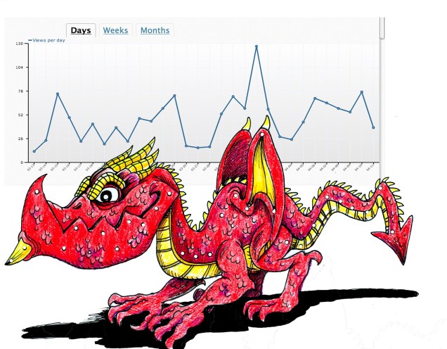
I decided to print out a screen grab of the stat graph for a given time period, and instead of “reading” it as a chart, use it as a starting point for an illustration: a drawing of a dragon. That way, the line stops signifying success or failure, and becomes the spine or outline of a beautiful, fierce, powerful creature. Over time, as the lines of the chart change, out of them emerges a series of unique images.
Why dragons? Partly because the long, dynamic lines of the graphs suggested something serpentine. Also because I wanted drawings/paintings that would speak to a dual essence of the topic: the danger of craving, as well as the healing potential for transforming our neuroses into insights. In making the “stat dragon,” we convert a visual lightning rod for greed into a source of creativity, celebration, and awesomeness. We stop attaching so much significance to ups and downs and achievement, appreciating instead the dynamism of varied, impermanent experience.
Thinking on it for weeks, I was digging the concept, but something was holding me back. Finally I realized what it was. Two things. For one, I’m not an illustrator. Drawing or painting might prove cathartic for me in some way, but they don’t bring me joy in general — not my thing, really. Secondly, I much prefer participatory projects. So I reached out to a few marvelous, talented illustrator friends, and the result, for your viewing pleasure over the next weeks, will be a lineup — a whole weyr! — of fabulous stat dragons.
The first of whom, above, is Bruce. I love him. Hope you do, too.