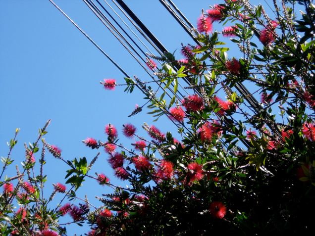
When I was about ten, my very favorite outdoor colorscape was a kind of calm, rich, horizontal trio of soft gray, dark brown, and brilliant green. You know how we associate scent with memories? Color works the same way for me (and probably for many of you, too). One or two shades can evoke a whole time and place and mode of being. Clay red and robin’s-egg blue bring me back to a wet walk through a southern Indian suburb. Rusty orange is the color of Barcelona. And yellow is the color of my bedroom: for nearly a decade, whenever and wherever I’ve been able to paint my walls, they’ve always turned out some kind of buttercup or saffron.
Yesterday I reconnected with color thanks to some more helpful tips from Soren Gordhamer’s book Wisdom 2.0. He says that in order to take a real break from computer work, we should try to (a) reduce information intake, (b) breathe deeply, (c) go outside (important one for me to remember!), (d) move around, and (e) keep communication to a minimum (147-148). So we should not, for example, read an article or catch up on a webcomic or play a computer game or text a lover or watch a TV show, even for fun. The most effective resting happens when we relax our discursive mind altogether, and anchor ourselves in experiences beyond screens and words.
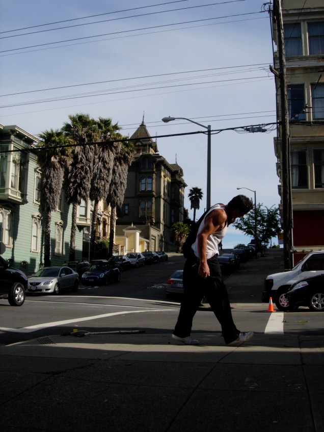
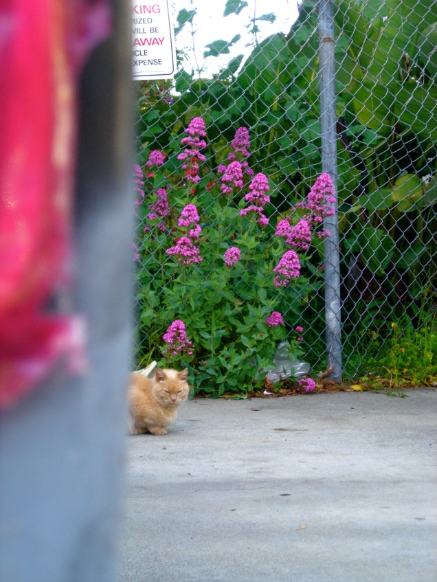
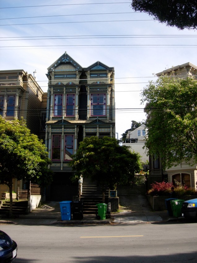
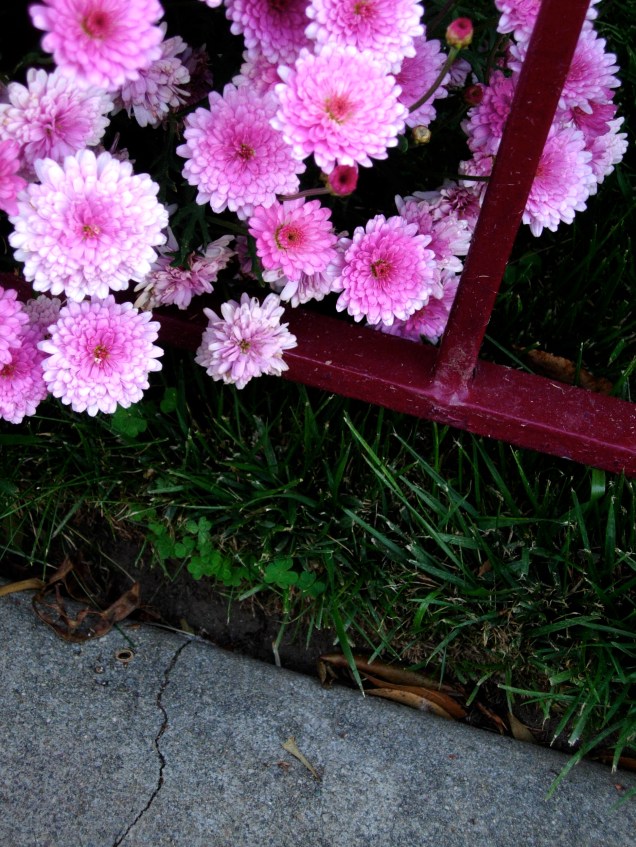
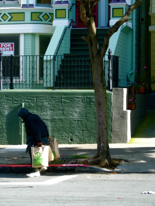
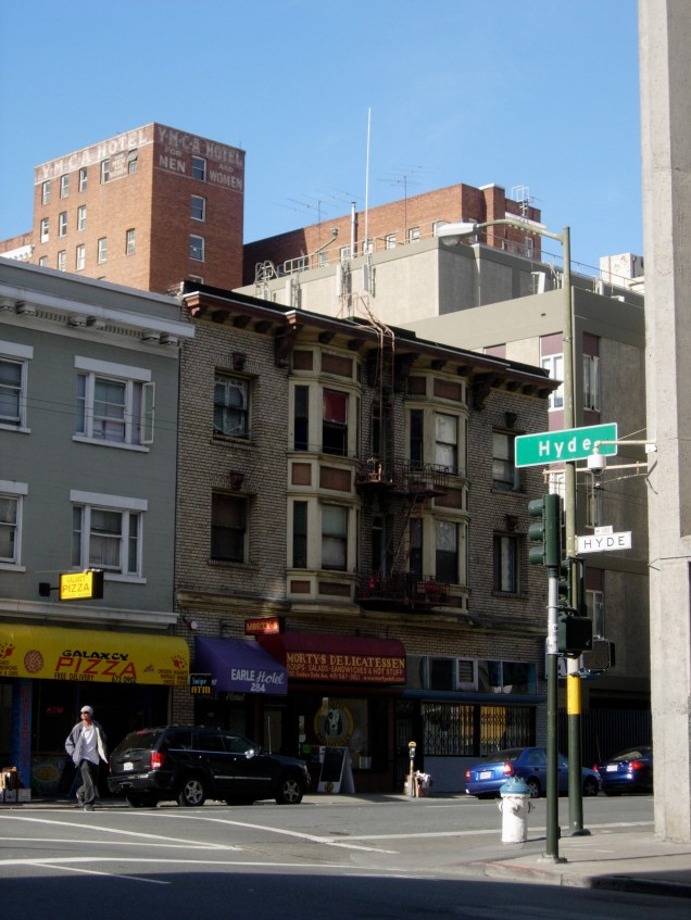
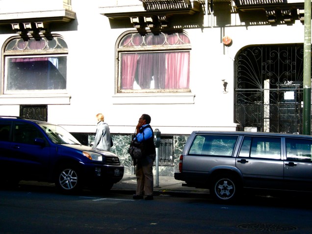
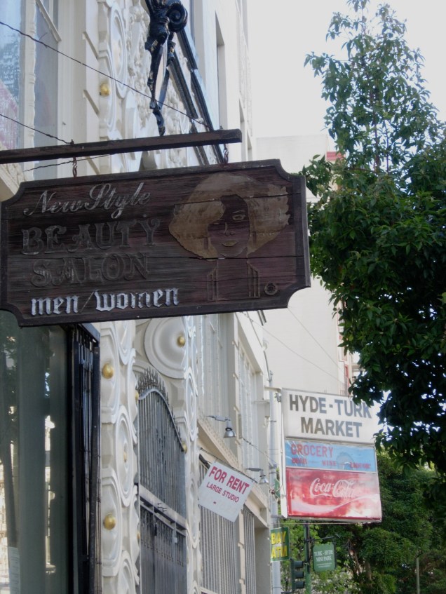
With that in mind, I decided that instead of rushing to take the bus home and return to my reading, I would take my camera and meander around the Western Addition on my way back to the Tenderloin.
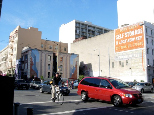
The world and I just open up to each other in a different way when I do this. So much more nourishing. And attentive, and sensory — I wish I could let you smell all the smells that I smelled. And I did also notice something significant: that as I crossed over from the Western Addition to the TL, my relationship to the colors shifted dramatically with the near-disappearance of organic green. The Tenderloin is the color of warehouse residencies and old advertising. Very different from the messy gardens and jewel-tone architecture near Alamo Square. Without getting too much into preferences, maybe this week I’ll make a special effort to note the chromatic anchors of each day.
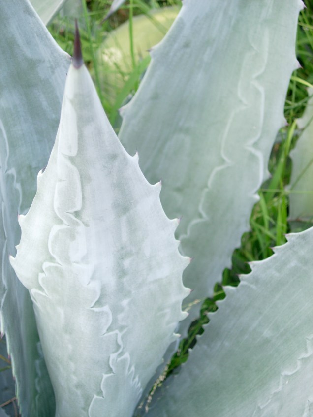
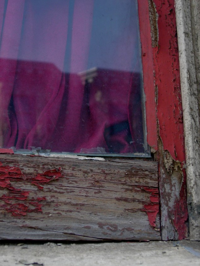
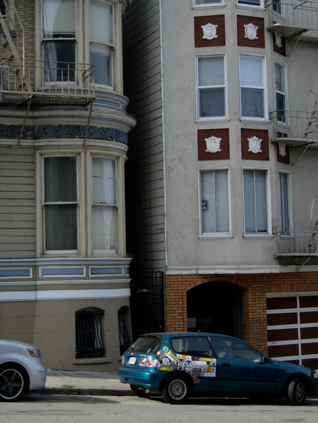

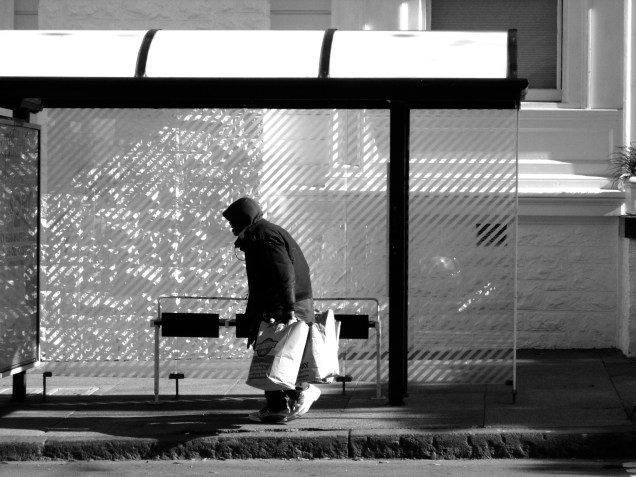
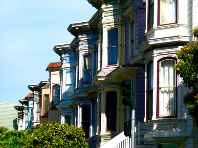
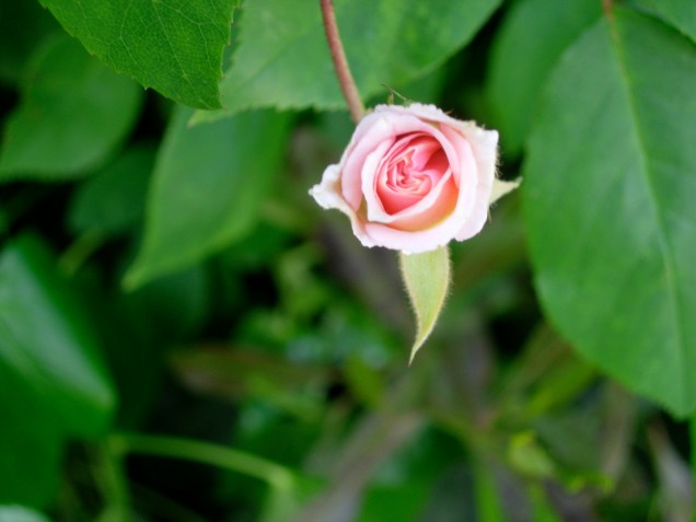
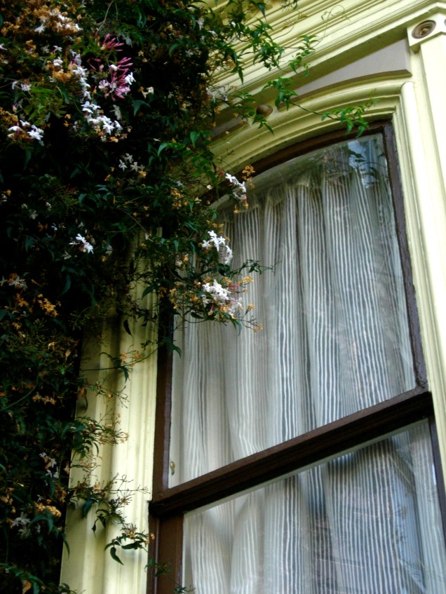

Dear colour-bearing IRIS of the Rainbows,
I was thinking about that lovely RED RED RED with golden/green tips of bottle-brush trees, after recently reading some theory by Albers on use of colour to control ideas, emotions, the embedded reflexes a colour contact unleashes in us, and wondering about colours around me in general…. and to see what you’re up to I found colour connections!! zing! that’s why the kozmik lattice is so__________!**! oh yeah!
i always dream of the east bay in colour, the sf side in both b&w & col.. the fog factor? or film noir brainwashing? great pix!! xxoo V.
Thank you for these thoughts and photos dear friend. I often overlook the objects and individuals around me, forgetting that anything can be quite arresting and inspiring when reduced to a simple instant.
I also bought a used copy of On Photography. Let’s make this book group happen. M
Thank you for the beautiful images of this city I currently call home! I’ve been feeling pretty disconnected to it lately and so it’s so sweet to see such moving images.
Thanks!
Beautiful post and photos, Katie! Some of my happiest and most ‘mindful’ moments were from the year I lived in the Western Addition and spent lots of time just walking around and watching people, buildings, flowers, animals, asphalt, etc., in the City… Such an exquisite blend of suffering and joy and beauty. Thanks for this.
Oh man…four amazing women on one thread! Thank you so much, y’all. Using a camera as a tool for mindfulness is great, and even better when the fruits can be shared — and everyone reflects on the images in their own way. Loving it.
Mandilove, I will check it out of the library today! Hooray! See you soon.